

Pantone’s 2022 Colour Of The Year Is Very Peri Nice
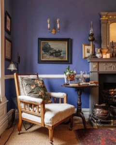
If you’re selling your home and arranging home staging, match your decor to Pantone’s luxury colour of 2022. Even if you’re not selling, do it anyway. Pantone defines the colour trend each year, guaranteeing that their selection is a hue that you can coordinate and match. Pantone is neither a person nor a hair colourant, but a firm situated in New Jersey. With their Pantone Matching System, they set colour marketing trends (PMS). They’re actually called The Pantone Colour Institute, which sounds ominous. This year’s breakthrough colour is “Very Peri”. It’s a tone so versatile that you’ll have an elegant time picking items that it complements. Afterwards, you’ll be receiving all the compliments. Because although it appears to be just a slip on the sporty side, it also happens to be graceful. We look at Pantone’s choice wall-brightener for 2022 and give our opinion.
Very Peri Is Calming As A Herb
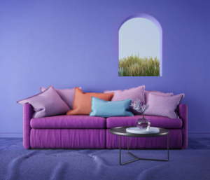
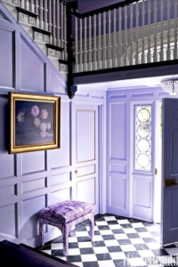
The deluxe colour of 2022 is Very Peri, which is a tone so relaxing it removes any need for anti-depressants or primal scream therapy. With Very Peri, the walls will shout “positivity and confidence” and fill admirers with so much energy that they’ll go back home and explode. But this isn’t all about them; it’s about making your home salubrious and invigorating its occupants. And with Very Peri, the walls won’t be shouting, they’ll be purring like a pedigree feline resting on a satin pillow. Very Peri is not a loud colour at all. But it comes peri-lously close to being so. Indeed, the choice was based on its reassuring aura. Their wordsmiths have knocked out some fine hockey to sell the colour. “Very Peri helps us to embrace this altered landscape of possibilities,” their website states. “It opens us up to a new vision as we rewrite our lives.”
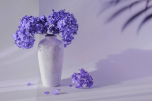
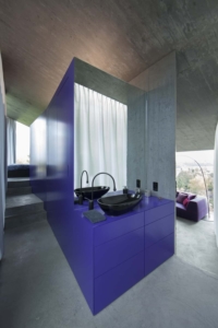
A subtle under-shade of violet, Very Peri is descended from periwinkle. That’s a myrtle herb with a colour in the blue and violet family. Pantone defines 2022’s super-colour as “a dynamic peri(winkle) blue hue with a vivifying violet-red undertone.” They chortle, “The (colour) blends the faithfulness and constancy of blue with the energy and excitement of red.” Hmmm. We’d love to believe that Oscar Wilde would’ve draped himself in Very Peri, but that’s quite unlikely. His favourite colour was green. Judi Dench or Maggie Smith might prefer it. It has less of a reminder of a toilet freshener than lavender does. Yet, despite its relationship to a natural herb, Pantone invokes futurism in its promotional copy. They suggest it offers a Promethean uplift after lockdown and equate it with digital gaming and the metaverse. That’s unfair. Those things represent the cold suppression of natural beauty and the synthesizing of aesthetics.
Very Peri Colour Matching
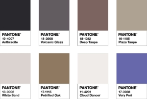
Pantone doesn’t just ponder the deeper connection between colour and the “global zeitgeist” it also produces colour charts. To help match with Very Peri they released four charts. They are Balancing Act, Wellspring, The Star of the Show, and Amusements.
Balancing Act
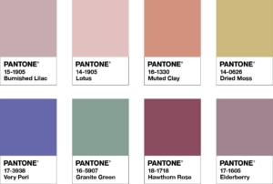
Balancing Act is a colour palette that features a natural combination of warm and cool tones that work well together. The brilliance of Very Peri is enhanced within this finely balanced palette. A sense of vitality and visual vitality.

Wellspring
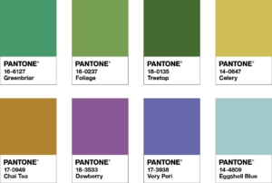
Wellspring is a holistic and balanced blend of nature-inspired colours that emphasise the greens’ harmony with the gentle Very Peri, as well as the mental health-promoting benefits of these delectably mild and alimentative hues.
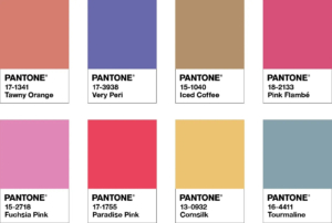
The Star Of The Show
Very Peri’s vibrant personality shines through in “The Star of the Show.” We surround this happiest and warmest of blue colours with a palette of classics and neutrals, whose essence of elegance and subtle stylishness sends a message of timeless sophistication.
Amusements
Pantone Very Peri lets its hair down with a few frivolities in the colour scheme of Amusements. So to speak. It tells a cheerful and whimsical tale of irrepressible fun and spontaneity in its colours. It’s a fun blue shade that encourages unrestricted creativity and exploration.
Conclusion
Pantone’s Very Peri is a colour that’s well worth adopting if you’re feeling the mental stress of this global age. After all, that’s what it’s about. The very idea of the colour is to be ameliorative. However, it’s just a guide and whatever colour you choose will be coordinated along a line of taste that makes you happy. But if you’re selling your home and want to go those extra yards you could do no wrong following this guide. If you can match one of the schemes then you’ll make your house stand out from the others. Knowing the colour trends will most certainly give you the edge when it comes to showing off your home. When it’s time to sell, we can help. Perfect Agent will match you with the right agent as superbly as Pantone matches colour tones. Contact us today!

